We’re going to create some plots using functions from the ggplot2 package. R packages usually contain functions related to a specific activity, which in this case is data visualisation, and also documentation which outlines how the functions work.
We’ve already installed the ggplot2 package. It was installed as part of the tidyverse package, which is a popular collection of packages developed by the same group of people.
Reading In Data
Each time we start a new RStudio session, we need to load the packages that we want to use, and to do this we use library().
library(tidyverse)
── Attaching core tidyverse packages ──────────────────────── tidyverse 2.0.0 ──
✔ dplyr     1.1.4     ✔ readr     2.1.5
✔ forcats   1.0.1     ✔ stringr   1.6.0
✔ ggplot2   4.0.0     ✔ tibble    3.3.0
✔ lubridate 1.9.5     ✔ tidyr     1.3.1
✔ purrr     1.2.0
── Conflicts ────────────────────────────────────────── tidyverse_conflicts() ──
✖ dplyr::filter() masks stats::filter()
✖ dplyr::lag()    masks stats::lag()
ℹ Use the conflicted package (<http://conflicted.r-lib.org/>) to force all conflicts to become errors
library(scales)
Attaching package: 'scales'

The following object is masked from 'package:purrr':

    discard

The following object is masked from 'package:readr':

    col_factor
library(Hmisc)
Attaching package: 'Hmisc'

The following objects are masked from 'package:dplyr':

    src, summarize

The following objects are masked from 'package:base':

    format.pval, units
After loading packages, the next thing we often need to do is to load some data into R. To load our spreadsheet in we use the read_csv() function from the readr package (which is loaded as part of the tidyverse package), and we’ll store it in an object called surveys.`
Rows: 16878 Columns: 13
── Column specification ────────────────────────────────────────────────────────
Delimiter: ","
chr (6): species_id, sex, genus, species, taxa, plot_type
dbl (7): record_id, month, day, year, plot_id, hindfoot_length, weight

ℹ Use `spec()` to retrieve the full column specification for this data.
ℹ Specify the column types or set `show_col_types = FALSE` to quiet this message.
You’ll notice some useful information printed in the console, including the number of rows and columns, and the number of different column types. chr refers to character, or columns containing text values, while dbl refers to double, another name for numeric values.
Now we can see surveys in our environment pane and we can click on it to take a look.
This dataset is taken from the Portal Project, a long-term study from Portal, Arizona, in the Chihuahuan desert, which measures features of desert-dwelling mammals. Click on the surveys object in the environment pane to see the data.
It’s worth pointing out, anything we do to the data in R is not changed in the file we read in.
To get a bit more information about any object in R, we can look at it’s structure:
str(surveys)
spc_tbl_ [16,878 × 13] (S3: spec_tbl_df/tbl_df/tbl/data.frame)
 $ record_id      : num [1:16878] 1 2 3 4 5 6 7 8 9 10 ...
 $ month          : num [1:16878] 7 7 7 7 7 7 7 7 7 7 ...
 $ day            : num [1:16878] 16 16 16 16 16 16 16 16 16 16 ...
 $ year           : num [1:16878] 1977 1977 1977 1977 1977 ...
 $ plot_id        : num [1:16878] 2 3 2 7 3 1 2 1 1 6 ...
 $ species_id     : chr [1:16878] "NL" "NL" "DM" "DM" ...
 $ sex            : chr [1:16878] "M" "M" "F" "M" ...
 $ hindfoot_length: num [1:16878] 32 33 37 36 35 14 NA 37 34 20 ...
 $ weight         : num [1:16878] NA NA NA NA NA NA NA NA NA NA ...
 $ genus          : chr [1:16878] "Neotoma" "Neotoma" "Dipodomys" "Dipodomys" ...
 $ species        : chr [1:16878] "albigula" "albigula" "merriami" "merriami" ...
 $ taxa           : chr [1:16878] "Rodent" "Rodent" "Rodent" "Rodent" ...
 $ plot_type      : chr [1:16878] "Control" "Long-term Krat Exclosure" "Control" "Rodent Exclosure" ...
 - attr(*, "spec")=
  .. cols(
  ..   record_id = col_double(),
  ..   month = col_double(),
  ..   day = col_double(),
  ..   year = col_double(),
  ..   plot_id = col_double(),
  ..   species_id = col_character(),
  ..   sex = col_character(),
  ..   hindfoot_length = col_double(),
  ..   weight = col_double(),
  ..   genus = col_character(),
  ..   species = col_character(),
  ..   taxa = col_character(),
  ..   plot_type = col_character()
  .. )
 - attr(*, "problems")=<externalptr>
Plotting with ggplot2
The gg in ggplot2 stands for “grammar of graphics”, which refers to a particular way of creating plots using a consistent vocabulary and layering different elements on. Therefore, we only need small changes to our code if the underlying data changes or we decide to make a box plot instead of a scatter plot. This approach helps you create publication-quality plots with minimal adjusting and tweaking.
ggplot plots are built step by step by adding new layers, which allows us to customise and test as we go. We’re going to use the following template to build our plots:
First we need to specify the data we want to use. Next, we can see that the ggplot() call has a function nested within it, aes(), which relates to aesthetic mappings. This is where we specify which parts of the data should be mapped to different axes on our plot. Finally, we need to specify the geometry we want to use, or in other words, the plot type. The geometry function we use is added to the end with a + sign.
Let’s go through step by step:
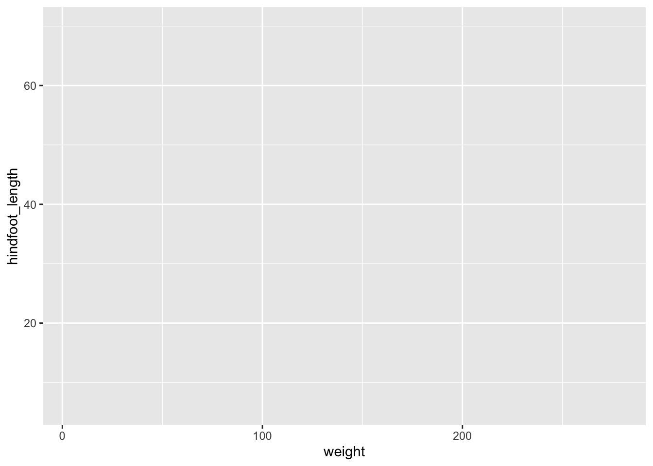
ggplot(data = surveys)
We get a blank plot because we haven’t told ggplot() which variables we want to correspond to parts of the plot.
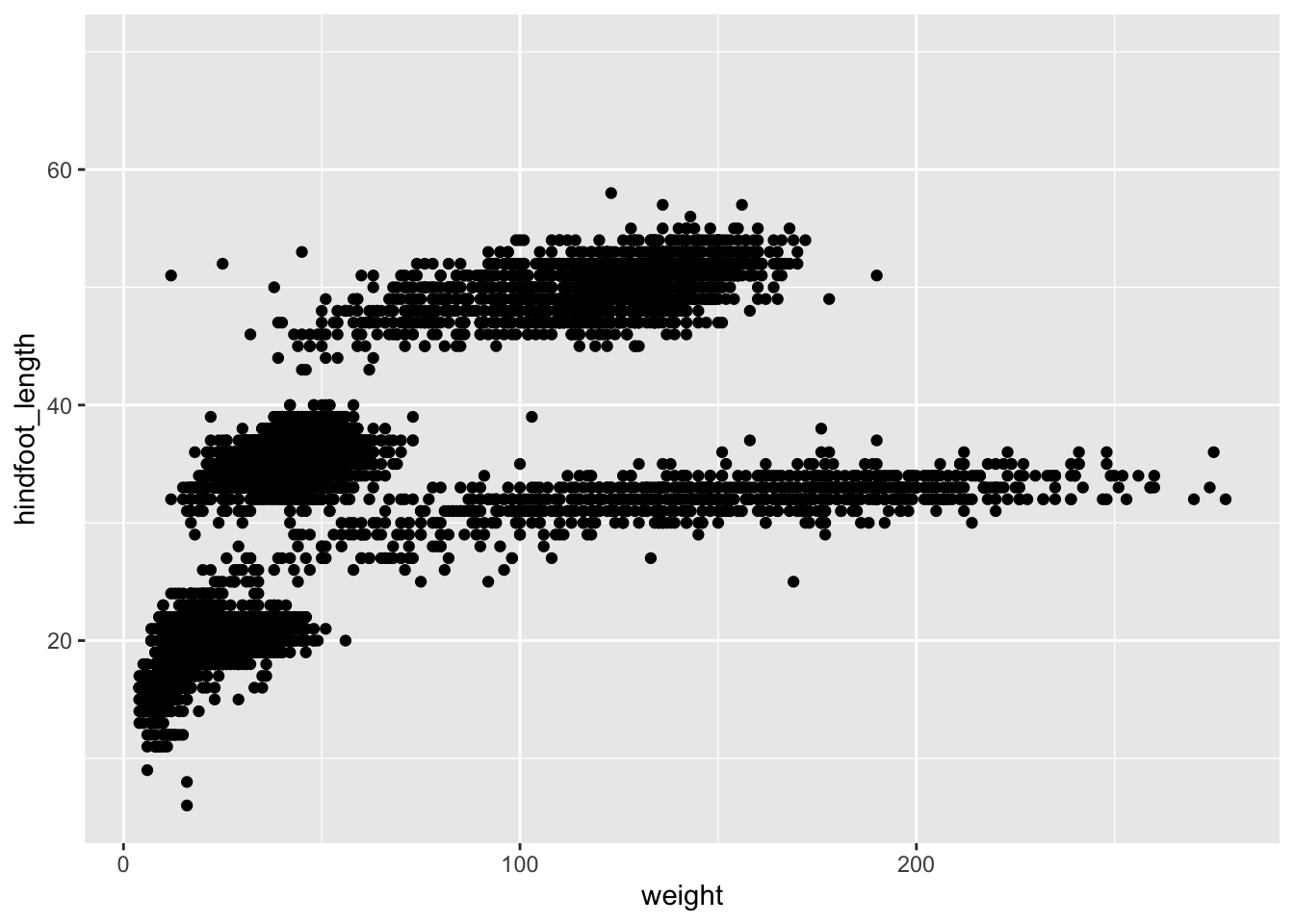
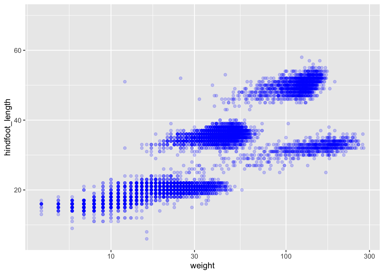
ggplot(data = surveys, mapping =aes(x = weight, y = hindfoot_length))
Now we’ve got a plot with x and y axes corresponding to variables from surveys. However, we haven’t specified how we want the data to be displayed. We do this using geom_ functions, which specify the type of geometry we want, such as points, lines, or bars. We can add a geom_point() layer to our plot by using the + sign. We indent onto a new line to make it easier to read, and we have to end the first line with the + sign.
Warning: Removed 3081 rows containing missing values or values outside the scale range
(`geom_point()`).
You may notice a warning that missing values were removed. If a variable necessary to make the plot is missing from a given row of data (in this case, hindfoot_length or weight), that observation can’t be plotted. ggplot2 warns us that this has happened to ensure we know there are missing values.
Another common type of message is an error, which means R can’t execute the command. This is commonly due to misspelling, or missing punctuation such as brackets or commas.
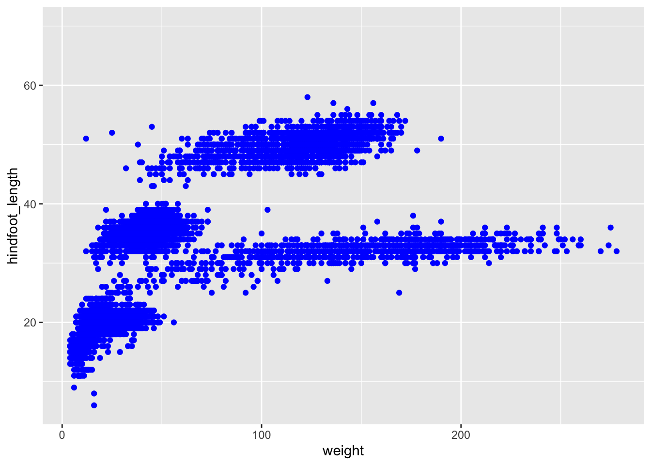
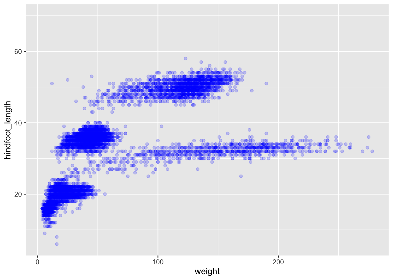
We can change the colour of the points by supplying a colour argument inside the geometry function.
Warning: Removed 2733 rows containing non-finite outside the scale range
(`stat_boxplot()`).
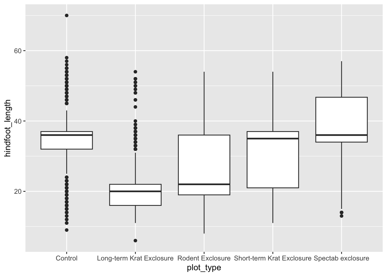
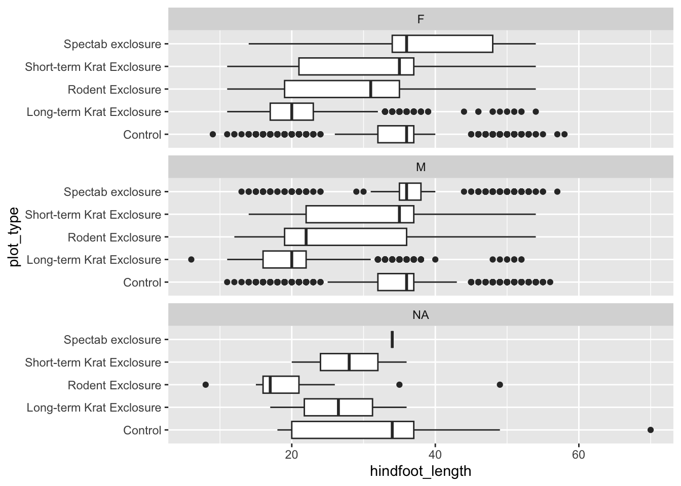
If we wanted to examine our data grouped by sex, we could facet the data into separate plots for each sex. We do this using the facet_wrap() function, and inside it we supply the column we want to facet by within the vars() function. We can also specify how we want the plots to be arranged by supplying either nrow or ncol.
Warning: Removed 2733 rows containing missing values or values outside the scale range
(`geom_col()`).
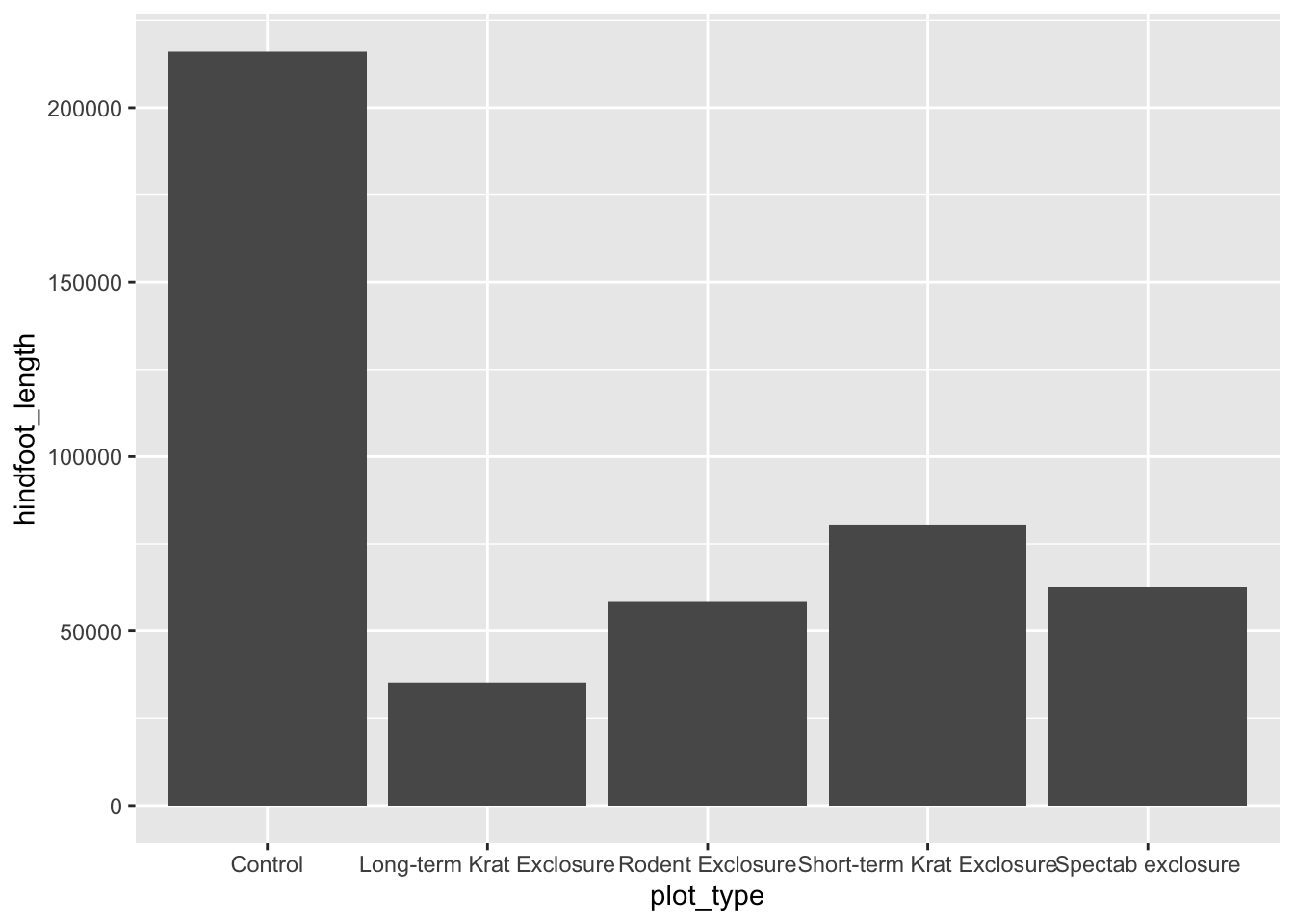
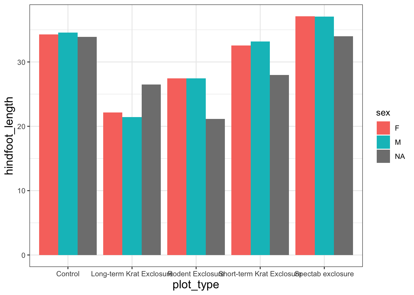
By default, geom_col() sums together all of the y values in each of our x variables. Let’s say we’re more interested in comparing a summary statistic, such as the mean hindfoot_length for each plot_type. We could do this by performing some operations on the data to calculate these numbers, as we’ll see tomorrow, but we can also do it within a layer on our plot.
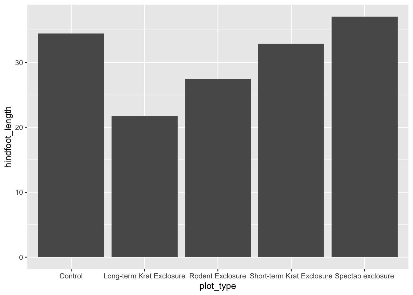
We’re going to use a function called stat_summary() to replace our geometry layer. This allows us to specify both the geometry to use, and the calculation to perform on the data (in our case mean).
Warning: Removed 2733 rows containing non-finite outside the scale range
(`stat_summary()`).
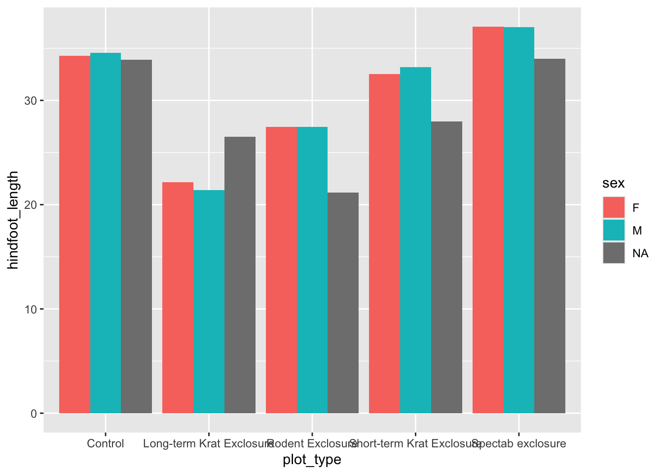
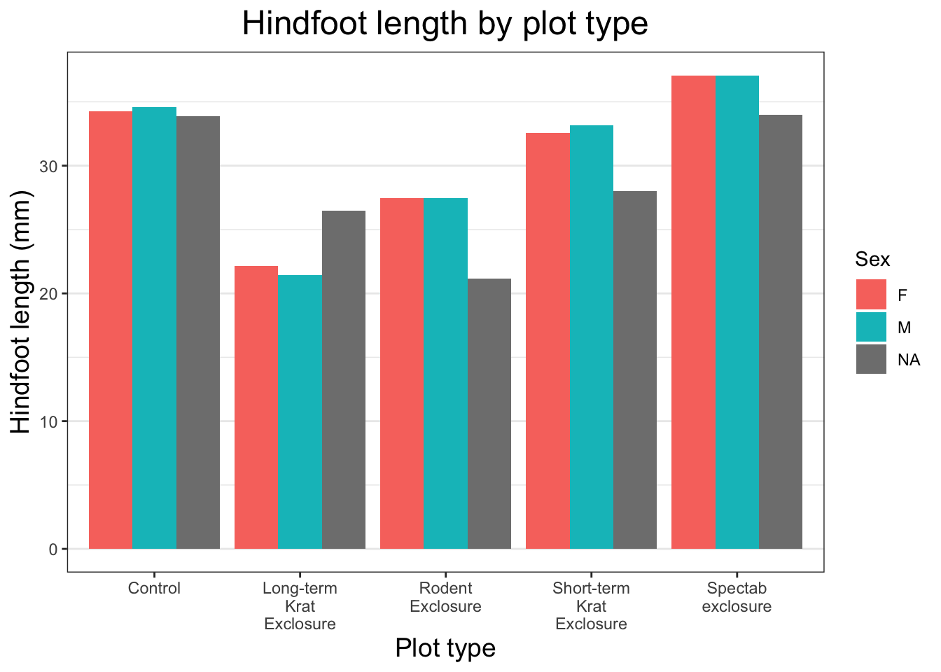
Now we have the mean hindfoot_length for each plot_type. To convert this plot to a grouped bar chart, we can add another aesthetic mapping to our original ggplot call. To create separate bars for each sex within our plot_type categories, we add fill = sex. To prevent the bars from being plotted on top of each other, we also need to specify position = position_dodge() in our stat_summary() call.
ggplot(data = surveys, mapping =aes(x= plot_type, y = hindfoot_length, fill = sex)) +stat_summary(fun ="mean", geom ="col", position =position_dodge())
Warning: Removed 2733 rows containing non-finite outside the scale range
(`stat_summary()`).
Changing themes
Now that all of the plot components are there, we can assign our plot code to an object to make it easier to experiment with the appearance of our plot. Let’s call it plot_mean_hf. Now if we run the name of the object R will produce the plot in the plot viewer pane.
plot_mean_hf <-ggplot(data = surveys, mapping =aes(x= plot_type, y = hindfoot_length, fill = sex)) +stat_summary(fun ="mean", geom ="col", position =position_dodge())plot_mean_hf
Warning: Removed 2733 rows containing non-finite outside the scale range
(`stat_summary()`).
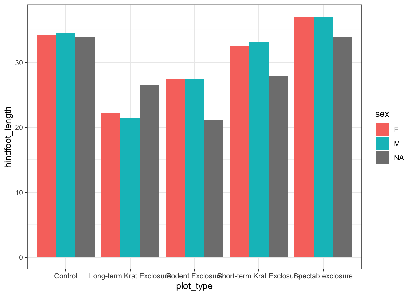
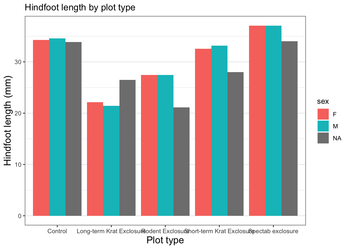
In general we use theme_ functions to change appearance, and we can add these as extra layers to our base plot by using the + sign on the end.
First, let’s take a look at the built-in black and white theme.
plot_mean_hf +theme_bw()
Warning: Removed 2733 rows containing non-finite outside the scale range
(`stat_summary()`).
The background is no longer grey, there is a black border, and the major and minor gridlines are now grey. theme_ functions control many aspects of a plot’s appearance all at once.
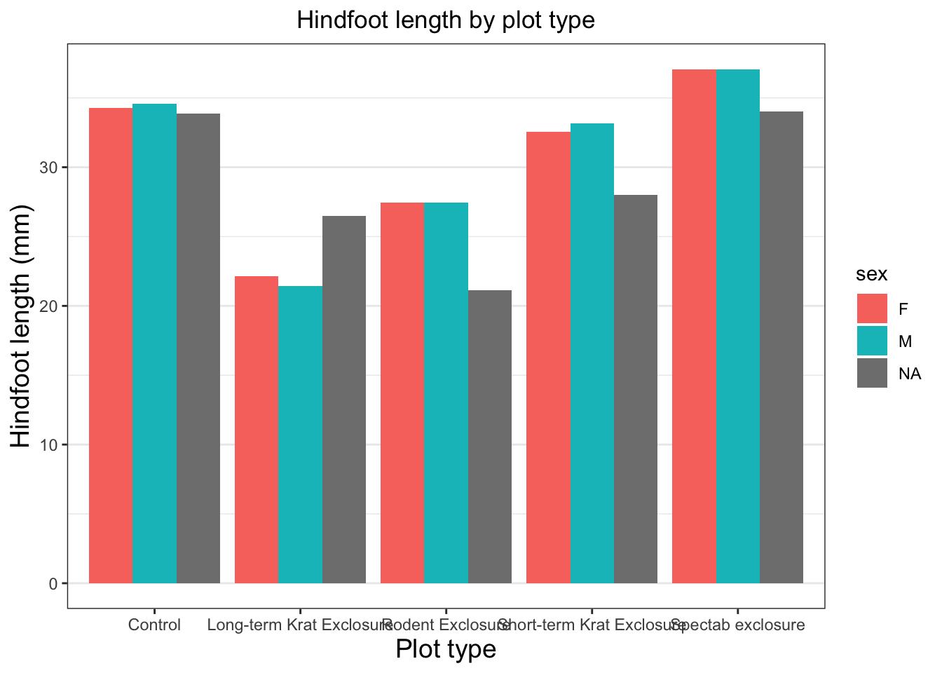
To change specific parts of a plot, we can use the theme() function to specify many different arguments which relate to the text, grid lines, background color, and more.
Let’s change the size of the text on our axis titles. We can do this by specifying that the axis.title should be an element_text() with size set to 14.
Warning: Removed 2733 rows containing non-finite outside the scale range
(`stat_summary()`).
Since our x axis is categorical, the vertical grid lines aren’t necessary. To remove them, we change the argument for panel.grid.major.x to element_blank().
Warning: Removed 2733 rows containing non-finite outside the scale range
(`stat_summary()`).
To centre align our plot title, we specify the horizontal justification (hjust) back in our theme() function. A value of 0.5 centres the title. 1 aligns it to the right side of the plot, 0 to the left.
Warning: Removed 2733 rows containing non-finite outside the scale range
(`stat_summary()`).
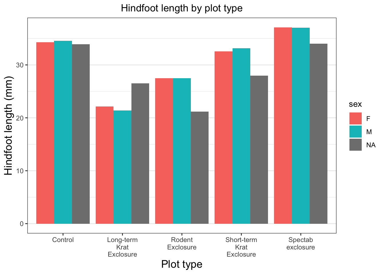
Next, let’s take care of those long, overlapping axis tick labels. We can handle this multiple ways, but we’ll show you how we would do it.
We’ll make use of scale_ functions to customise the x (scale_x_) and y (scale_y_) axes. Because we’re working with a bar plot, the x axis is divided into several discrete categories, so we use scale_x_discrete(). By providing the label_wrap() function from the ‘scales’ package, we’re telling R to wrap the text of our labels and insert line breaks where appropriate.
Warning: Removed 2733 rows containing non-finite outside the scale range
(`stat_summary()`).
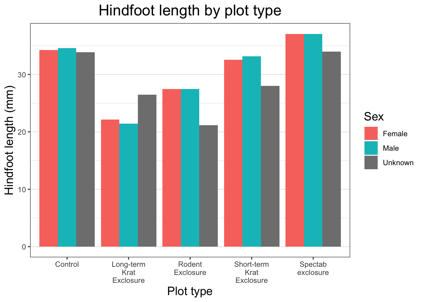
Lets sort out that legend. First we can capitalise the name of the legend by adding another argument in our labs argument. Given that we initially mapped the sex column to the fill aesthetic, that is the title we will provide.
Warning: Removed 2733 rows containing non-finite outside the scale range
(`stat_summary()`).
To change the names of the values within the legend we use another of our scale_ functions. We use scale_fill_discrete because sex is a discrete variable mapped to the fill aesthetic.
Warning: Removed 2733 rows containing non-finite outside the scale range
(`stat_summary()`).
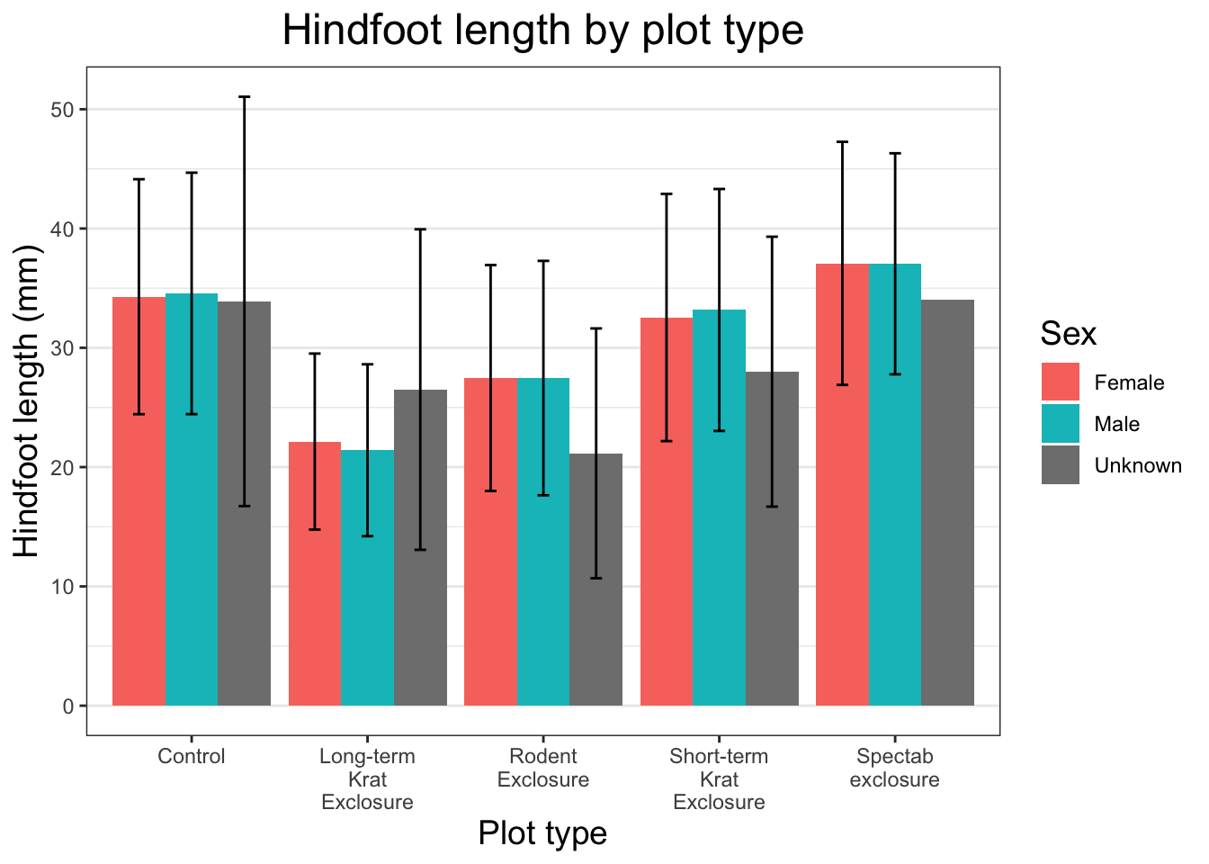
The last thing we should do to make this plot publication ready is to add some error bars. We’ve refrained from doing this until the end as there is quite a bit of code in this one function, but we think it’s really useful to know.
There are lots of different statistics we could represent using error bars. Here, we will calculate the standard deviation in each group and add this as error bars to each bar in our plot. We add this as another layer using another stat_summary() call. This is the same function that we used to plot our bars in the first place, and we need it because it allows us to calculate some descriptive statistic. We pass in several arguments for this stat_summary() call:
fun.data = mean_sdl to calculate our mean and standard deviation
fun.args = list(mult = 1) to specify the multiplier we want applied to our error bars (1 is equal to our mean +/- 1 * SD).
geom = "errorbar" to select the type of geometry we want to display
width = 0.2 to specify the width of the error bars
position = position_dodge(0.9) to ensure error bars are placed appropriately
Warning: Removed 2733 rows containing non-finite outside the scale range
(`stat_summary()`).
Removed 2733 rows containing non-finite outside the scale range
(`stat_summary()`).
One thing you will notice is that the NA sex for the “Spectab exclosure” plot_type does not have an error bar. This is because there’s only one data point, so the standard deviation cannot be calculated.
Great, we have our publication ready plot. Let’s overwrite our existing object and get ready to export this plot so it can be used in our publication.
You can also specify one of the below optional arguments to set where the image will be saved:
path: the path of the directory we want to save our plot in (if not already in our filename).
create.dir: whether to create a new directory if the directory specified in path doesn’t exist.
File type
ggplot supports both vector and raster formats. Vector formats store images as instructions, which means they can be resized without any loss of quality, whereas raster formats store images as fixed arrays of pixels, meaning they cannot be resized without losing quality. The JPEG format we used above is an example of a raster format - the image resolution is fixed when it is saved, so it cannot be resized very much without looking bad.
Supported vector formats:
.pdf (Portable Document Format, when unflattened)
.svg (Scalable Vector Graphics)
.eps (Encapsulated PostScript)
Supported raster formats:
.png (Portable Network Graphics)
.jpg or .jpeg (Joint Photographic Experts Group)
.tiff or .tif (Tagged Image File Format)
.bmp (Bitmap)
Sometimes a journal will ask for figures in a vector format so that they can size the image appropriately based on the typesetting of the document. Otherwise, most of the time you’ll select a raster format and set the size of the image yourself. To do this you need to use the following optional arguments:
width & height: plot size in units defined by the units argument.
units: one of the following - “in”, “cm”, “mm”, “px” (defaults to inches).
dpi: plot resolution in dots per inch (defaults to 300).
Clarifying DPI
Confusion around DPI is common. People often conflate DPI with other attributes of images relating to their size, or to the supposed ‘quality’ of an image.
There are three properties that determine the size and quality of an image:
Resolution: the pixel dimension of a screen or an object on a screen, expressed as width x height (e.g. 1920x1080).
Print size: the physical dimensions of an image when printed, typically measured in inches for photos.
DPI: Dots per inch, or the density of ink dots printed onto paper.
To obtain the print size of an image, the resolution is divided by the DPI set inside the image metadata. For example, if an image has a resoltuion of 900x900 pixels, and the DPI in the image is set to 300, then the image will be printed at 3 x 3 inches. The DPI setting inside the metadata of a digital image has absolutely no bearing on how that image is represented on a screen, only when it is printed or added into something like a Word doc which shows you how a document will look when printed.
It’s common for journals to ask for figures based only on a particular DPI (often 300), but this by itself is meaningless. You could send them an image with a resolution of 150 x 150 pixels and a DPI set to 300, but when printed it would only be half an inch by half an inch. What they really mean is they want images with “a resolution large enough to display the image at the chosen size when printed.”
If you need to set a DPI and physical size, then the resolution will be determined by multiplying the two together.For example, let’s say we need our plot to be 3 x 3 inches on the page and 600 DPI.
This results in an image with those pixel dimensions, and the default value of 300 DPI has been entered into the image metadata. This means the image will be sized at 5 x 4 inches on a page by default, and if it is resized to be larger than this, it will look bad.