We’re going to create some plots using functions from the ggplot2 package. R packages usually contain functions related to a specific activity, which in this case is data visualisation, and also documentation which outlines how the functions work.
We’ve already installed the ggplot2 package. It was installed as part of the tidyverse package, which is a popular collection of packages developed by the same group of people.
Reading In Data
Each time we start a new RStudio session, we need to load the packages that we want to use, and to do this we use library().
library(tidyverse)
── Attaching core tidyverse packages ──────────────────────── tidyverse 2.0.0 ──
✔ dplyr     1.2.1     ✔ readr     2.2.0
✔ forcats   1.0.1     ✔ stringr   1.6.0
✔ ggplot2   4.0.3     ✔ tibble    3.3.1
✔ lubridate 1.9.5     ✔ tidyr     1.3.2
✔ purrr     1.2.2
── Conflicts ────────────────────────────────────────── tidyverse_conflicts() ──
✖ dplyr::filter() masks stats::filter()
✖ dplyr::lag()    masks stats::lag()
ℹ Use the conflicted package (<http://conflicted.r-lib.org/>) to force all conflicts to become errors
After loading packages, the next thing we often need to do is to load some data into R. To load our spreadsheet in we use the read_csv() function from the readr package (which is loaded as part of the tidyverse package), and we’ll store it in an object called surveys.
Rows: 16878 Columns: 13
── Column specification ────────────────────────────────────────────────────────
Delimiter: ","
chr (6): species_id, sex, genus, species, taxa, plot_type
dbl (7): record_id, month, day, year, plot_id, hindfoot_length, weight

ℹ Use `spec()` to retrieve the full column specification for this data.
ℹ Specify the column types or set `show_col_types = FALSE` to quiet this message.
You’ll notice some useful information printed in the console, including the number of rows and columns, and the number of different column types. chr refers to character, or columns containing text values, while dbl refers to double, another name for numeric values.
Now we can see surveys in our environment pane and we can click on it to take a look.
This dataset is taken from the Portal Project, a long-term study from Portal, Arizona, in the Chihuahuan desert, which measures features of desert-dwelling mammals. Click on the surveys object in the environment pane to see the data.
It’s worth pointing out, anything we do to the data in R is not changed in the file we read in.
To get a bit more information about any object in R, we can look at it’s structure:
str(surveys)
spc_tbl_ [16,878 × 13] (S3: spec_tbl_df/tbl_df/tbl/data.frame)
 $ record_id      : num [1:16878] 1 2 3 4 5 6 7 8 9 10 ...
 $ month          : num [1:16878] 7 7 7 7 7 7 7 7 7 7 ...
 $ day            : num [1:16878] 16 16 16 16 16 16 16 16 16 16 ...
 $ year           : num [1:16878] 1977 1977 1977 1977 1977 ...
 $ plot_id        : num [1:16878] 2 3 2 7 3 1 2 1 1 6 ...
 $ species_id     : chr [1:16878] "NL" "NL" "DM" "DM" ...
 $ sex            : chr [1:16878] "M" "M" "F" "M" ...
 $ hindfoot_length: num [1:16878] 32 33 37 36 35 14 NA 37 34 20 ...
 $ weight         : num [1:16878] NA NA NA NA NA NA NA NA NA NA ...
 $ genus          : chr [1:16878] "Neotoma" "Neotoma" "Dipodomys" "Dipodomys" ...
 $ species        : chr [1:16878] "albigula" "albigula" "merriami" "merriami" ...
 $ taxa           : chr [1:16878] "Rodent" "Rodent" "Rodent" "Rodent" ...
 $ plot_type      : chr [1:16878] "Control" "Long-term Krat Exclosure" "Control" "Rodent Exclosure" ...
 - attr(*, "spec")=
  .. cols(
  ..   record_id = col_double(),
  ..   month = col_double(),
  ..   day = col_double(),
  ..   year = col_double(),
  ..   plot_id = col_double(),
  ..   species_id = col_character(),
  ..   sex = col_character(),
  ..   hindfoot_length = col_double(),
  ..   weight = col_double(),
  ..   genus = col_character(),
  ..   species = col_character(),
  ..   taxa = col_character(),
  ..   plot_type = col_character()
  .. )
 - attr(*, "problems")=<pointer: 0x59728a5e46c0>
Plotting with ggplot2
The gg in ggplot2 stands for “grammar of graphics”, which refers to a particular way of creating plots using a consistent vocabulary and layering different elements on. Therefore, we only need small changes to our code if the underlying data changes or we decide to make a box plot instead of a scatter plot. This approach helps you create publication-quality plots with minimal adjusting and tweaking.
ggplot plots are built step by step by adding new layers, which allows us to customise and test as we go. We’re going to use the following template to build our plots:
First we need to specify the data we want to use. Next, we can see that the ggplot() call has a function nested within it, aes(), which relates to aesthetic mappings. This is where we specify which parts of the data should be mapped to different axes on our plot. Finally, we need to specify the geometry we want to use, or in other words, the plot type. The geometry function we use is added to the end with a + sign.
Let’s go through step by step:
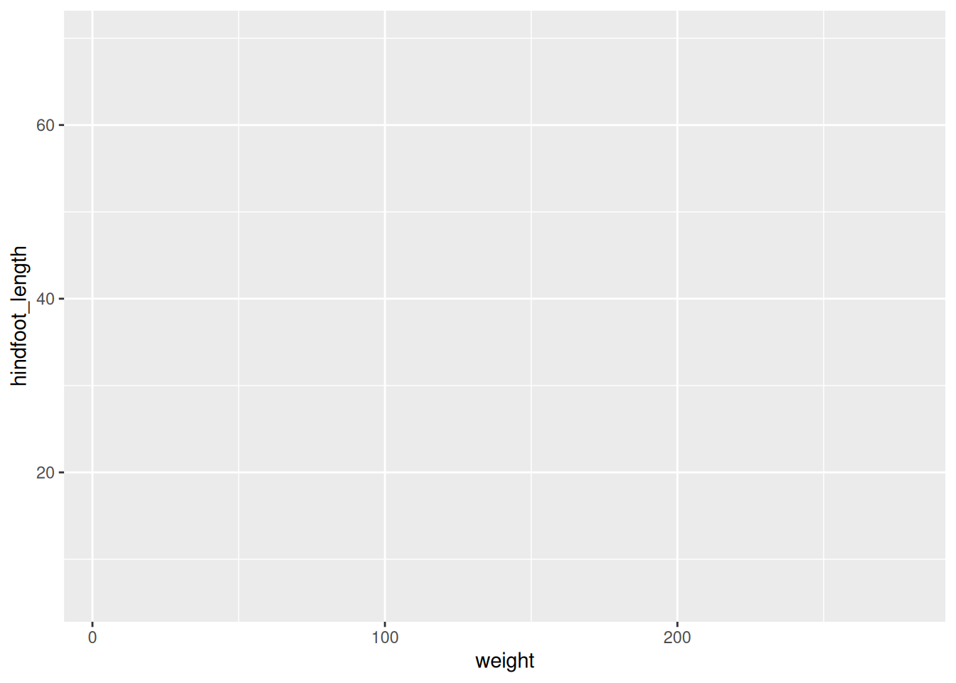
ggplot(data = surveys)
We get a blank plot because we haven’t told ggplot() which variables we want to correspond to parts of the plot.
ggplot(data = surveys, mapping =aes(x = weight, y = hindfoot_length))
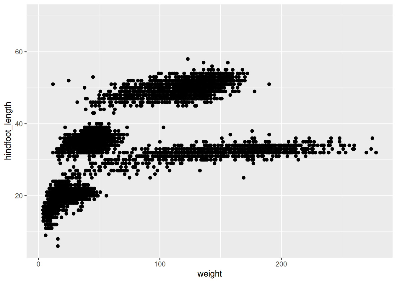
Now we’ve got a plot with x and y axes corresponding to variables from surveys. However, we haven’t specified how we want the data to be displayed. We do this using geom_ functions, which specify the type of geometry we want, such as points, lines, or bars. We can add a geom_point() layer to our plot by using the + sign. We indent onto a new line to make it easier to read, and we have to end the first line with the + sign.
Warning: Removed 3081 rows containing missing values or values outside the scale range
(`geom_point()`).
You may notice a warning that missing values were removed. If a variable necessary to make the plot is missing from a given row of data (in this case, hindfoot_length or weight), that observation can’t be plotted. ggplot2 warns us that this has happened to ensure we know there are missing values.
Another common type of message is an error, which means R can’t execute the command. This is commonly due to misspelling, or missing punctuation such as brackets or commas.
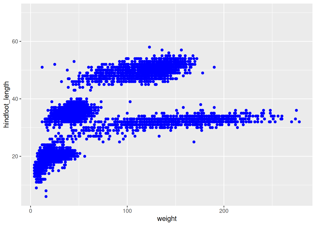
We can change the colour of the points by supplying a colour argument inside the geometry function.
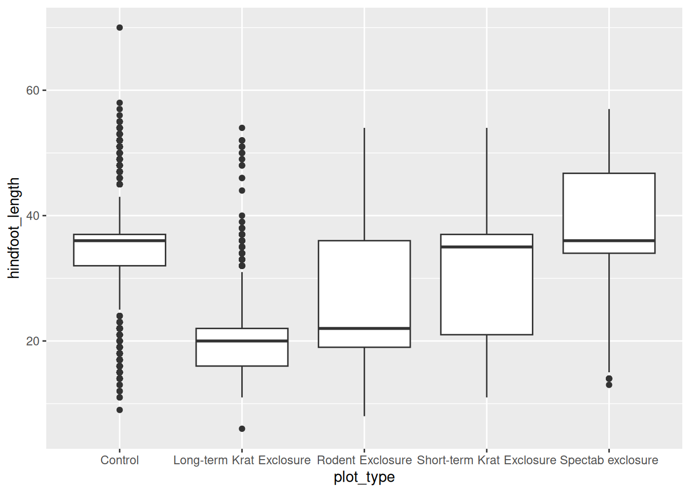
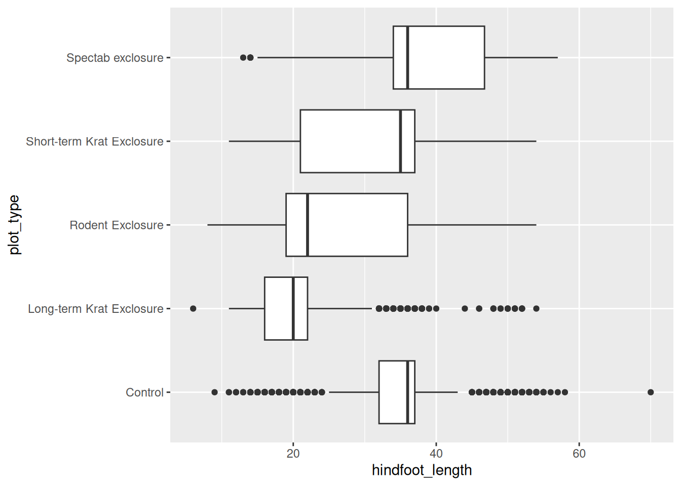
Warning: Removed 2733 rows containing non-finite outside the scale range
(`stat_boxplot()`).
Changing themes
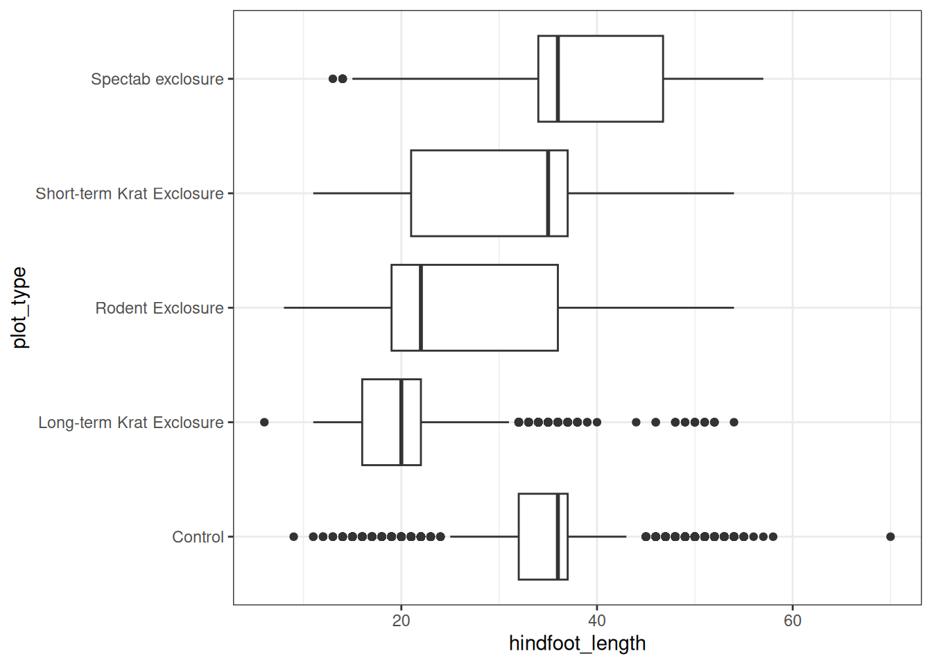
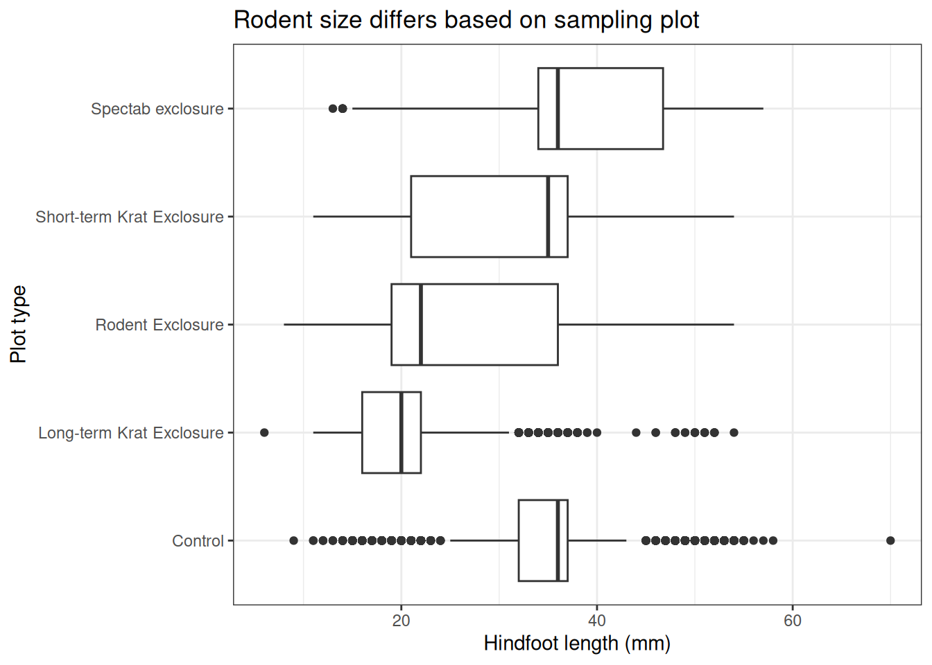
To go from our initial plot, to a publication-ready figure we often neeed to change aspects of the plot’s theme. We can use some themes built in to ggplot to change lots of things at once.